Colors play an essential role in our lives, influencing our emotions and behaviors in different ways. They are able to evoke a wide range of emotions and feelings, from happiness and excitement to sadness and anger. As such, choosing the right color palettes for your branding or design is crucial to effectively convey your message and connect with your audience. This is where Designs.ai’s Colormatcher comes in handy.
The Psychology of Color Palettes

The psychology of colors is a complex topic that has been studied extensively by researchers and designers alike. Different colors have been shown to evoke different emotions and moods, and understanding these associations can help you create designs that resonate with your target audience.
For instance, red is often associated with passion, energy, and excitement. It’s a color that can grab attention and create a sense of urgency, making it a popular choice for marketing campaigns. On the other hand, blue is often associated with trust, reliability, and calmness. It’s a color that can create a sense of security and stability, making it a popular choice for financial institutions and healthcare brands.
Other colors such as yellow, green, and purple also have their own unique associations. These colors can be used to evoke different emotions and moods in your designs. However, it’s important to note that cultural and personal experiences can also influence how we perceive different colors. In some cultures, white is associated with purity and innocence, while in others it’s associated with mourning and death.
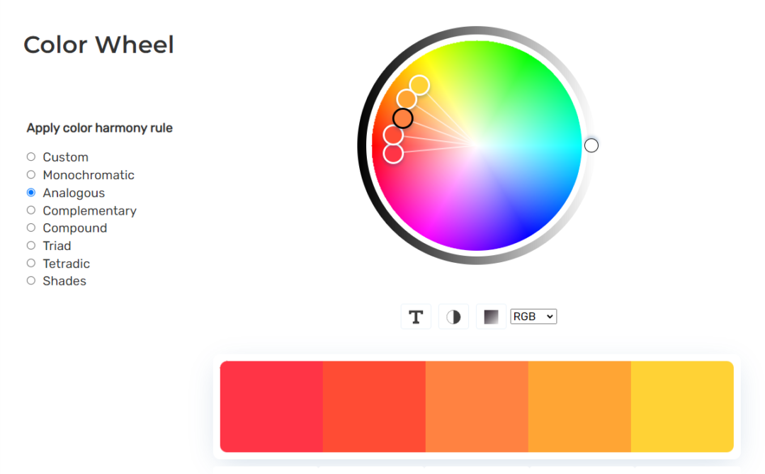
How to Create Color Palettes with Colormatcher
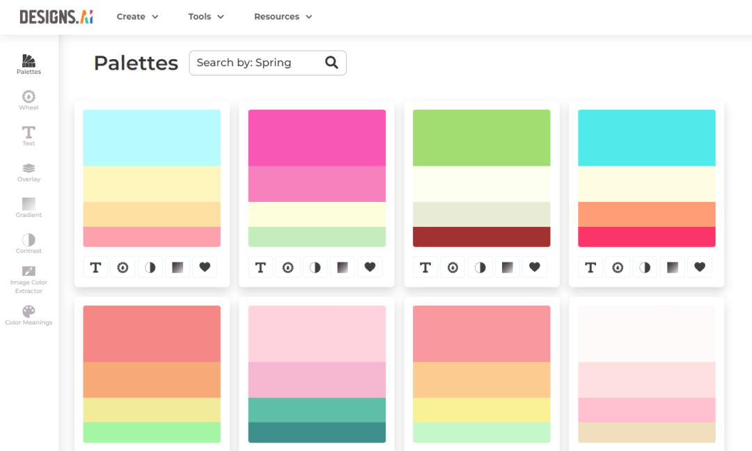
Designs.ai’s Colormatcher takes these associations into account and helps you choose the right color scheme for your branding based on the emotions you want to convey. The tool uses artificial intelligence to analyze your input and suggest color palettes that align with your desired emotions.
For example, let’s say you’re creating a website for a new fashion brand. You want the design to be fresh, exciting, and trendy, so you input those emotions into Colormatcher. The tool then generates color palettes that includes shades of pink, purple, and blue – colors that are often associated with creativity, youthfulness, and sophistication.
Alternatively, if you’re creating a website for a financial institution, you may want to evoke feelings of trust, security, and stability. In this case, you can input those emotions into Colormatcher, and it will suggest a color palette following those prompt. For instance, Colormatcher might generate color palettes using shades of blue, green, and gray – colors that are often associated with reliability, safety, and professionalism.
Why You Should Use Colormatcher
With Designs.ai’s Colormatcher, you can take the guesswork out of choosing the right color scheme for your branding or design. You can be confident that your color palette will effectively convey the emotions you want in order to connect with your audience on a deeper level.
Additionally, Designs.ai’s Colormatcher can help you create a consistent brand identity across all your marketing materials. By using the same color palette across your marketing content, you can create a cohesive brand image that resonates with your target audience.
Overall, choosing the right colors for your branding is essential to effectively convey your message and connect with your audience. Designs.ai’s Colormatcher can help you achieve this by suggesting color palettes that align with the message you are trying to convey. Through Colormatcher, you can create designs that effectively communicate your brand’s values and connect with your audience on a deeper level.
Looking to create a product that allows your audience to express themselves through colors? Check out our blog on how to create a coloring book here.