Introduction: What is ‘Layout design’?
Designing content is all fun and games until you’re sat down with the ultimate dilemma of a question: What, where, and how do I begin? It’s the stuff of nightmarish procrastination for any designing content creator. This is why layout design is a fundamental process in every designer’s day-to-day work; it sets the basic and standard framework for any planned content idea. Essentially, layout design involves arranging the most important visual elements (images, texts, and shapes) on a page in the most visually appealing way possible, according to the intended audience. While designing is commonly thought to be free and easy, there are rules to adhere to when it comes to layout design and composition–but don’t worry! Here’s the lowdown on design layouts and how to achieve the best style for your content.
Visual Hierarchy: Emphasis and Scale
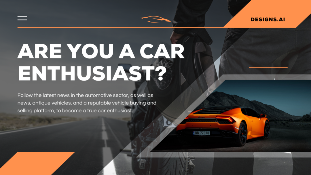
A great layout design ensures that there’s a hierarchy of information, arranged and organized in a way where the viewer can easily determine what’s being emphasized. Every design needs that eye-catching visual emphasis to hold a viewer–this can be easily achieved by utilizing size, position, and contrast adjustments. But before all that, you need a focal point: The main subject of the design. Determining the focus of the design will allow for more structure, giving a viewer the ease of scanning a design’s elements in a way that makes sense.
Orientation and alignment
So you’ve decided on your focus and you’ve also adjusted the size and position of it–now what? Now comes the orientation and alignment aspect of your design. In order to maintain a viewer’s attention, every element in your design needs to achieve a sort of consistency. For example, text alignment: Viewers are at ease with reading text that’s centered in the middle or placed on far-right margins.
Balance
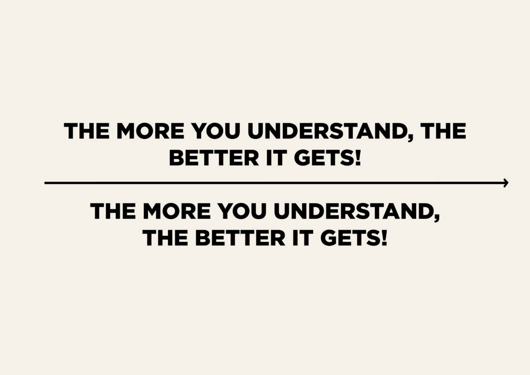
Balance is everything in design. Even if a design was intentionally made to look somewhat chaotic, its elements would still be arranged in harmony to maintain balance. It’s important that both visual and textual information need to be symmetrically or asymmetrically balanced in a design to ensure that viewers don’t feel a disconnect in understanding what’s being conveyed. As an example: Textual information, especially when there’s a title and subtitle (or smaller paragraphs) needs to be placed in balance so that it’s easier to read.

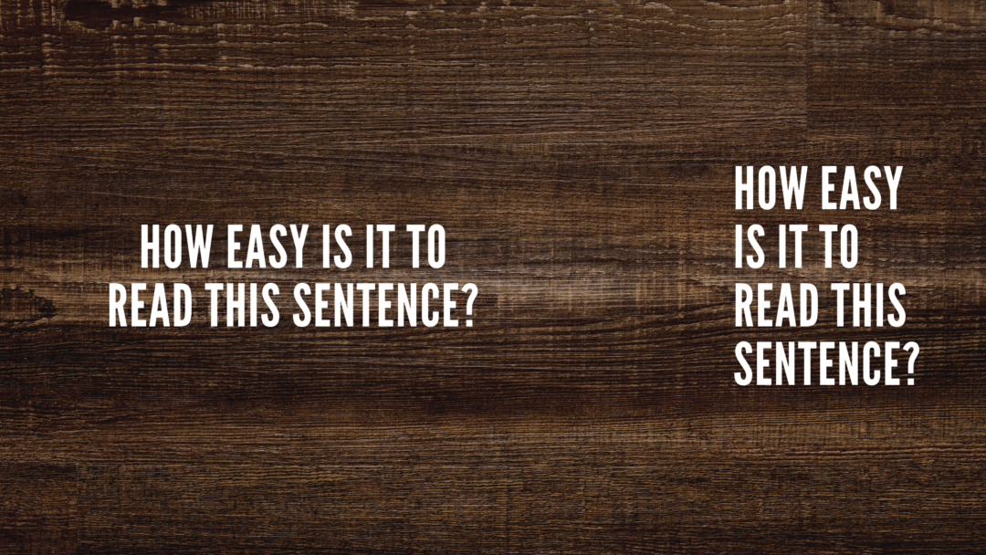
Text Breaks
Similar to keeping balance in every element present in a layout design, here’s what you should strive for in terms of breaking text for more intuitive viewer-reading:
- Ensure that important phrases are kept together
- Return or break the line after punctuations
- Match/group color and typefaces together
- Adjectives are paired with their nouns
- Keep proper nouns together
Color
What makes a design pop? Colors! However, that doesn’t mean that they have to be bright and rainbow-themed all the time. Colors elicit moods and attraction in viewers, depending on the motive of the design–so choose your set of colors and get meddling with the contrast, shading, vibrance, and saturation.