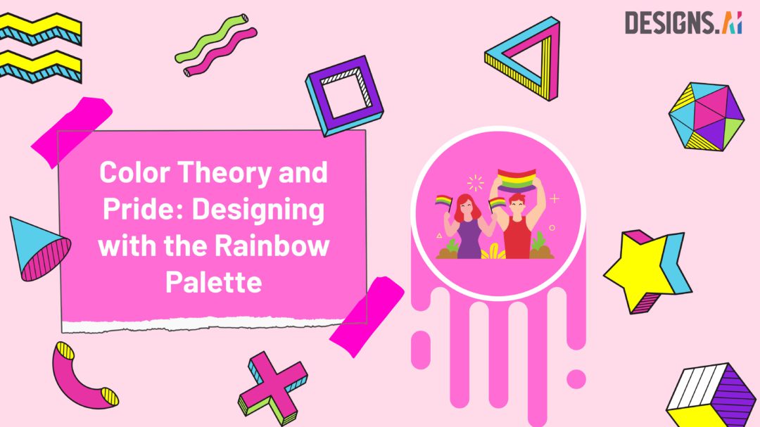
Color Theory and Pride. June is a time of celebration, reflection, and unity. It marks the onset of Pride Month, a period dedicated to honoring the LGBTQ+ community and amplifying the message of love, diversity, and acceptance. At Designs.ai, we’re recognizing Pride Month by exploring a spectrum of colors that best embody its spirit – rainbow color palettes. These palettes serve not only as a vibrant salute to Pride Month but also offer boundless design inspiration for creatives worldwide.
The Symbolism of the Rainbow
The rainbow, with its broad spectrum of colors, is more than just a beautiful natural phenomenon. It is a potent symbol of the LGBTQ+ community, representing diversity, acceptance, and pride. The original Pride Flag was designed by artist Gilbert Baker in 1978. It consists of six colors, each signifying a unique element of life and community: red for life, orange for healing, yellow for sunlight, green for nature, blue for harmony, and purple for spirit. Utilizing these colors in your designs can pay tribute to the ethos of Pride Month, adding depth and significance to your creative works.
Color Theory 101
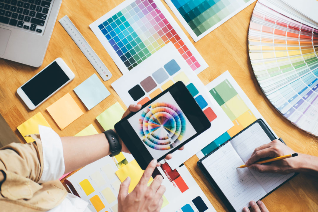
Understanding color theory is crucial for any graphic designer. It is the science and art of using colors to create a specific emotion, reaction, or impression. Certain colors, when paired together, can create a harmonious effect, while others can form a stark contrast, capturing attention and evoking strong emotions.
Warm colors like red, orange, and yellow tend to bring out feelings of warmth, comfort, and energy. Conversely, cool colors such as green, blue, and purple often evoke feelings of calm, peace, and serenity. When designing with a rainbow color palette, understanding these relationships between colors can help you create designs that are both aesthetically pleasing and emotionally resonant.
Top 10 Rainbow Color Palettes for Pride Month
- Classic Pride: The original six colors of the Pride Flag. This palette conveys a powerful message of pride and unity.
- Pastel Pride: Soft, muted tones of the rainbow colors that offer a subdued, gentle feel.
- Neon Pride: Bright, electric hues for designs that truly stand out. This palette is perfect for a modern, vibrant look.
- Earthy Pride: This palette features warm, natural colors for an organic, grounded feel.
- Oceanic Pride: Shades of blue and green that reflect the serene beauty of the sea and sky.
- Sunrise Pride: Warm and bright, like the break of dawn, this palette brings a sense of hope and optimism.
- Dusk Pride: Dark, rich hues that capture the tranquil beauty of a setting sun.
- Royal Pride: Regal shades of purple, blue, and red that convey a sense of luxury and elegance.
- Candy Pride: Sweet, playful colors that are perfect for fun, youthful designs.
- Retro Pride: Vintage-inspired colors that evoke a sense of nostalgia.
Incorporating Rainbow Color Palettes in Designs
Whether you’re designing a logo, a poster, or a website theme, rainbow color palettes can add a vibrant and inclusive touch to your work. Through design tools like Designs.ai, you can easily integrate these color palettes into your projects. The platform allows you to input exact color codes, ensuring you achieve the precise shades you’re after.
But remember, balance is crucial. When working with multiple colors, it’s important to maintain harmony in your design. Layering, transparency, and blending can help manage the vibrancy of colors, preventing any one color from overpowering the rest.
Conclusion
As we commemorate Pride Month, it’s essential to remember that diversity and inclusion go beyond mere words. They’re cornerstones of the creative industry, shaping our perspectives and enriching our design work. Rainbow color palettes aren’t just aesthetically pleasing; they stand as a bold symbol of unity, acceptance, and love, aligning perfectly with the ethos of Pride Month.
By incorporating these palettes into your designs, you’re not only celebrating diversity, but you’re also promoting inclusivity in a universally understood language. The language of color and design. During this Pride Month and beyond, we encourage you to explore the power of these vibrant color palettes, letting them inspire and shape your creations.
We invite you to share your creations on social media platforms, tagging Designs.ai, and using the hashtag #DesignWithPride. This sharing promotes a cycle of inspiration, fostering a sense of community and solidarity. It’s also a chance to spotlight the beauty of inclusive design, sparking creativity and generating content that continues to honor and celebrate the spirit of Pride Month.
In conclusion, embracing diversity and inclusivity in design isn’t just about creating visually appealing work; it’s about embodying a broader narrative that resonates with a diverse audience. So this Pride Month, let’s create, share, and celebrate the vibrant colors of pride and diversity, one design at a time!
Need help mastering the art of storytelling? Explore our blog on The Art of Storytelling for Modern Marketers to level up your storytelling skills. Check it out here!