If you’re looking to add a soft and delicate touch to your designs, pastel colors are the perfect choice. These muted hues provide a soothing and calming effect, making them perfect for a variety of design projects.
But how do you incorporate pastel colors into your designs in a cohesive and visually appealing way? That’s where Designs.ai’s Color Matcher comes in.
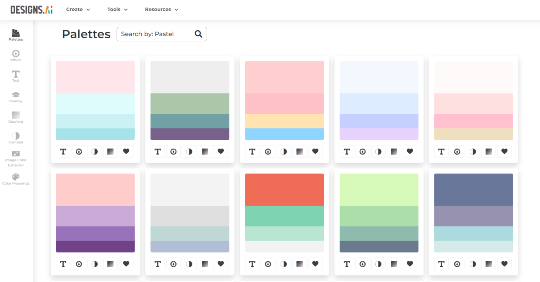
Our advanced tool allows you to easily match and experiment with different pastel color palettes, giving you the ability to create beautifully cohesive designs. Simply upload your design, choose the pastel color palette you want to use, and watch as the Color Matcher seamlessly integrates the shades into your design.
Not only does the Color Matcher make it easy to incorporate pastel colors into your designs, it also helps you achieve professional-level results. No more fumbling around with color swatches or trying to match shades by eye – the tool does all the work for you.
So why not elevate your designs with the help of pastel colors and Designs.ai’s Color Matcher? Give it a try and see the magic for yourself.