
2020 was everything but a comfort zone. Most of us are cooped up at home and designers have less to work with. Designs that speak to comfort, nostalgia, positivity, and knowledge will be big this year. We know how important it is to stay on trend and not fall back. Here are 7 design trends you’ll want to know in 2021.
-
- Serif fonts
- Flat illustrations
- Geometric shapes
- Muted color palette
- Nature-inspired designs
- Optical illusion design
- Social media carousels
-
Serif Fonts
There’s been a re-emergence of a particular typeface popping up left and right in the design world: serif. Serif fonts are recognizable by the little nub on a character. That little nub is known as a ‘line’ or a ‘pen stroke’.
Here are some examples:
The serif font type is one of the most common families of fonts you can spot today. It dates back to the 15th century, and that’s why it’s associated with a sense of tradition, timelessness, elegance, and credibility. One thing that makes serif fonts easier to navigate when reading is the nubs, which is why it is the number one font type preference for traditional print media and publishers who use long blocks of text. Some of the most common serif fonts include Times New Roman, Georgia, and Garamond.
After a year of unprecedented events, people are craving stability and trustworthiness even in fonts. We are expecting that this trend of classic serif fonts will stick around for some time. Serif fonts are already being adopted by Mailchimp and Vogue.


But choosing font types is tricky, and using the same typeface can make your design look crowded if not done right. The type of font used is also the biggest impression your brand or design can give to the audience. If your brand is something more long-established or sophisticated, using the classic serif fonts will definitely help you convey that message.
Use these Designmaker’s templates to capture design trends of that class serif voice: Blue and Green Financial Consultation Post, and Deep Green Jazz Event Poster.
-
Flat Illustrations
The flat, shadowless, two-dimensional illustrations mimic real-world counterparts in how they appear. We’re no longer in that era where artists and designers create complicated and flashy animations to wow audiences. Minimalism is still very much present in today’s design trends, and that has given birth to flat illustrations.
These clean and crisp illustrations are versatile as they can be adapted to many different graphics like infographics and presentations. It’s also big on digital web design and mobile interfaces, due to its uniqueness, humanistic touch and flexibility. So, be sure to incorporate flat illustrations to satisfy your user’s aesthetic needs.
You can get your hands on thousands of free illustrations by Graphicmaker here: Modern Flat Set, Flat Vector Set, Flat Circle Set, Flat Geometric Set, and Flat Outline Set.
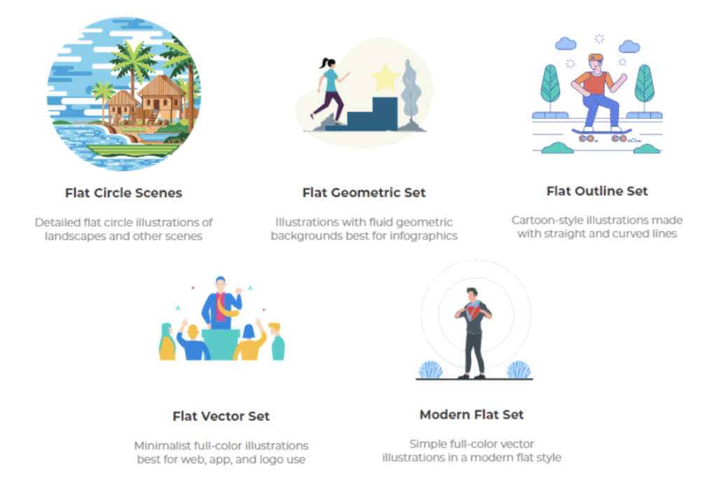
You can also change the colors on the illustrations to your liking, and they’re also being constantly updated by the team here at Designs.ai.
A close cousin of flat illustrations is flat logo designs. Flat design isn’t just limited to illustrations. Many brands like Burger King, Petco, and BMW have been switching up their logo designs to have a more minimalistic, flat look.
It’s time to bid farewell to realistic and detailed skeuomorphism and a big fat (flat) welcome to these two-dimensional illustrations because they are here to stay.
-
Geometric Shapes
We learn to recognize shapes before we start to learn words. You can think of it as going back to the building blocks of how we recognize and interact with designs around us. The most common shapes we know are circles, squares, and triangles.
There are distinct meanings and connotations to every shape. For instance, when we see a group of yellow hexagons, the first thing that comes to mind is honeycomb cells. Similarly, when we see a red octagon, we know that it means stop.
By understanding the different meanings behind basic shapes, you can create illustrations with a stronger message behind them. Circles are used to represent harmony, totality, inclusion. As circles have no point of a beginning or an end, it is used to represent the life cycle. Squares and rectangles convey a silent message of reliability, stability, honesty, and straightforwardness while triangles represent power and direction.
The use of geometric shapes in designs are seen a lot on social media postings like these:
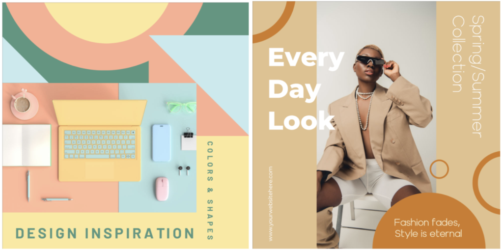
Or you can simply add geometric shapes to your designs as an added visual element.
Try out these recommended geometric-themed templates on Designmaker here: Pastel Professional Business Card, Orange IT Webinar With Organic Shapes, and Muted Pink Art Quote Inspiration Post.
-
Muted Color Palette
They were trendy in 2020 and they are still trending in 2021. Muted colors are the opposite of bright, vivid, and saturated colors. Muted colors are subtle and desaturated with white, black, or a complementary color. They match well with the design trends of flat illustrations that we talked about.

Especially with the rise of going back to raw and organic, many companies have utilized muted tones in their marketing campaigns. They feel more genuine and relax that it’s not right up in your face.
In fact, Pantone’s Colors of the Year 2021 (Illuminating and Ultimate Gray) are a testament to muted, relaxed colors growing in popularity.

LinkedIn uses muted colors flawlessly. Therefore, a big company that was previously emotionally distant now seems much more personable and down to earth. Given especially the hardships that many faced in 2020, it only makes sense that companies want to be more welcoming and comforting.
Definitely expect to see more brands jump on the muted color palette trend. If you want in on this trend as well, here are some palettes to get your creative juices flowing.
-
Nature-Inspired Designs

Nature is trending! 2020 was a year with a lot of emphasis on environmentalism and sustainability, and it has no signs of stopping anytime soon. So, it’s not surprising that it is reflected in our designs as well. People are realizing the importance of having nature in our space after being cooped up inside for so long too!
Nature-inspired designs are designs that incorporate the elements of nature. It focuses on using elements such as plants, organic shapes, neutral and muted colors (usually greens and browns), and natural lighting to replicate the feeling of being in nature.
Try out these nature-inspired designs: Deep Forest Minimal Instagram Post, Holy Guacamole Birthday Card, and Muted Green and Brown Gardening Workshop Instagram Ad.
No surprise that our outdoor elements are creeping into our four walls. Nature isn’t just trending on social media and marketing campaigns, they are also present in interior design and architecture.
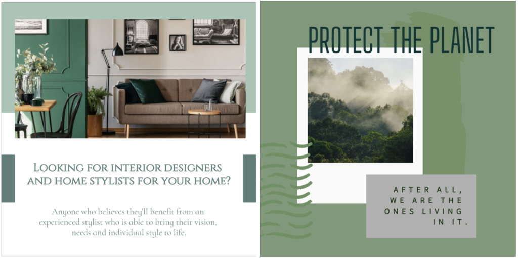
A close sibling of nature-inspired design is socially conscious design. People are incorporating messages of environmental activism into visual art and marketing campaigns to be forward-thinking. Designers are channeling their inner fire to do better for the environment and their community.
-
Optical Illusion

Taking a break from muted, nature-inspired, organic, mindful design trends, something that you’ll see occurring more are intriguing and mind-boggling optical illusion designs. After a crazy year, we need of a little magic, at least some imagery to get lost in.

Wonky, confusing optical illusion designs that you have to take a double-take will come into play. This year we’ll see optical illusions integrated into different visuals and logo designs. Just go all out and create fun designs for the heart. This fairs well is catching an audience’s attention.
Optical illusion designs are most associated with brands that thrive in spirituality or being query and in your face. Be sure not to overdo it and if you’re choosing to participate in this design trend, make sure that it’s not steering away from your brand identity but enhancing it and adding value to your audience instead. The visual impacts are great at catching your audience’s attention, but it is hard to pull off.
Simple lines forming boxes that look 3D, shades, and shadows making an object look like you’re able to touch through the screen. The illusions are endless.

-
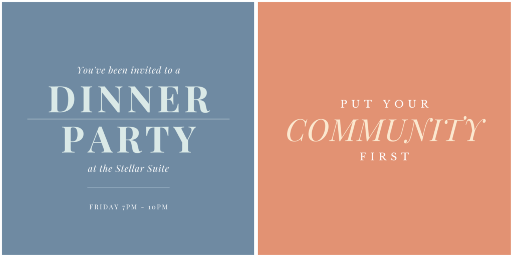
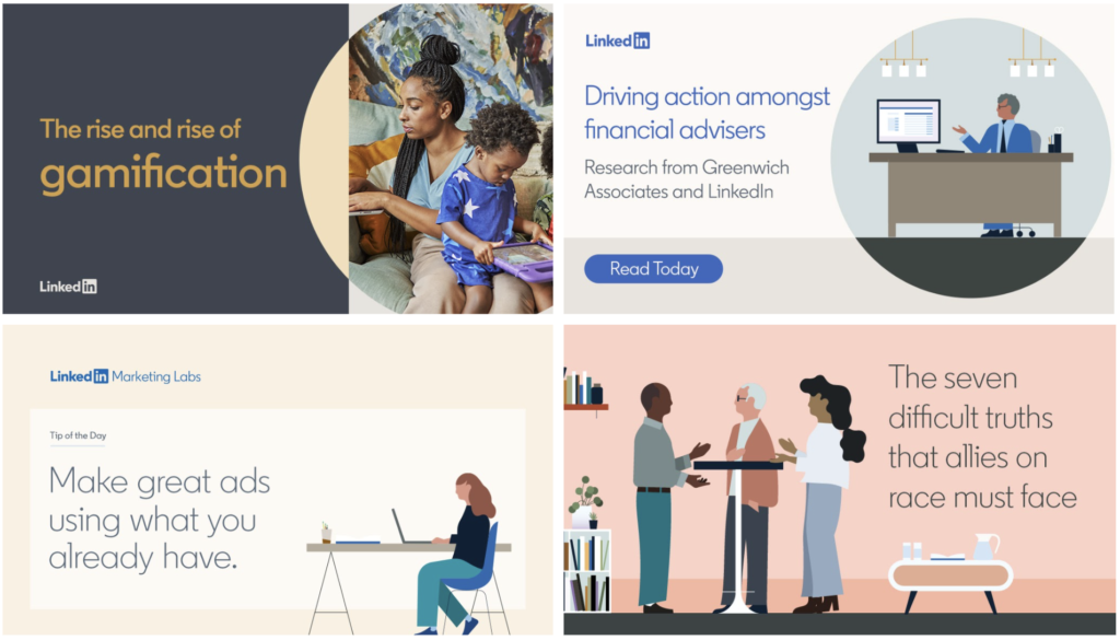
Social Media Carousels
A social media carousel is basically two or more slides together. The audience scrolls or swipes through the carousel like a slideshow. This is especially prominent in infographics or educational social media profiles that carry buckets of information.

There are a few reasons why social media carousels will be getting into the mainstream way of posting on social media. It’s a quick and easy way to capture the short attention span of people nowadays.
You’ll be able to direct them to different landing pages, highlight multiple features and go in-depth to explain it, explain the process of something, give a step-by-step guide, or create a larger visual experience. It really is up to your creativity!
To recap, the design trends you should expect to see this year are: serif fonts, flat illustrations, geometric shapes, muted color palettes, nature-inspired designs, optical illusions, and social media carousels. We’re excited to see you take these trends and put your own spin on them. With that in mind, only use the trends if they fit well with your branding so it doesn’t confuse your customers!
READ MORE: