Colors and content are the focal points of a design. These elements illicit interest and keep viewers hooked. However, oftentimes while we invest in these factors, elements like fonts and their pairing with the design become an afterthought.
But, fonts play a crucial role in design. It brings personality with itself, pairing just any font with a design can potentially lessen the impact of the creative work. From a more practical standpoint, using fonts that do not jive together simply makes it harder for people to understand or read your design; the work loses its readability, value & impact.
So, if randomly choosing fonts does not work, what does?
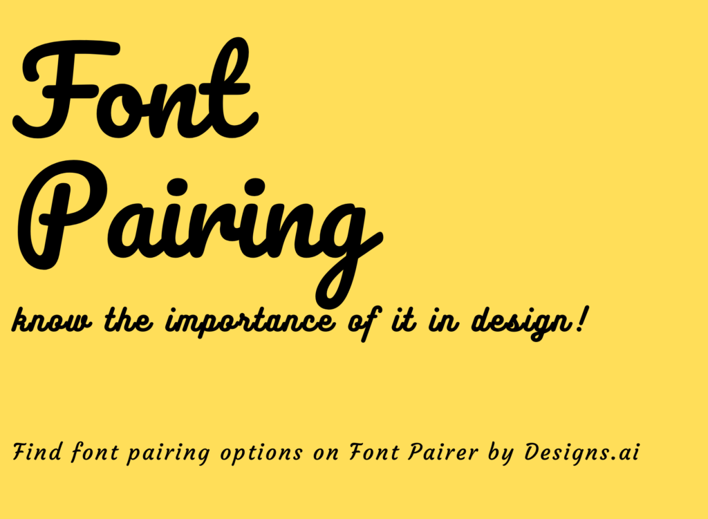
Below are some helpful tips and guidelines to follow and make font pairing easy and effective. Remember, the goal is not to use just any “pretty fonts” because you prefer it, but to get font pairings that represent your designs and brand accurately.
Here are some TIPS on how you can get font pairings just right:
1. Be clear on your brand personality
Even before scouting for the right fonts, it’s important to understand the intent of your design, especially if it is brand-related. Knowing your brand would mean, choosing a Sans Serif to represent a corporate company for a more professional feel. As mentioned, fonts have a character and personality of their own, these need to be utilized, or else clashing fonts can cause to misrepresent & contradict the brand persona.

Fonts belonging to the Serif family are heavily used by brands that are more corporate, as the font personality & the typography anatomy delivers a professional feel.
2. Pair with complementary fonts
Everyone has preferences, some gravitate towards more professional-looking fonts like Serif, others may prefer the whimsical nature of Scripts. This could prove to be problematic if when pairing fonts, you have a tendency to choose a certain style. This bias towards a certain style may create busy-looking designs, as instead of complementing each other, the fonts end up competing with one another like the example below.
You can still have your favorite style featured, just make sure to have a complementary font instead of a competing one in your design to make full use of a font. These days online tools like Font Pairer make it incredibly easy to find complementary fonts. Simply, key in the font you want and where you want it i.e. header, sub-header or body, and the tool will deliver complementary fonts for that particular style of font. A better pairing between different font styles improves readability.

Side note: Do not forget about complementary colors for your fonts. A good font pairing may go in vain if not paired with colors that have adequate contrast. To better understand color contrast use the Color Checker aspect of Color Matcher which will generate the right color pairing for you; delivering a seamless transition between background and text.
3. Experiment with your choices
Sometimes even the nicest of combinations may not translate properly on certain outlets, this is why experimentation is necessary. The pairing needs to blend seamlessly and match the personality of the brand. One way to cut down on experimentation time is by using Font Pairer. The tool provides multiple style choices along with the font style that complements it-changing up the font pairing can be done in mere minutes with this tool.

4. Understand the basic design principle of font pairing
If you are stuck on how to start, here is a basic design principle to follow. A website or design usually consists of three fonts; the heading, sub-heading, and body. This means for each design you should have at least 3 fonts ready for use. As mentioned earlier, the goal is to find complementary fonts. Font Pairer makes this quite easy to do, when choosing a header font they immediately provide you with sub-heading and body font suggestions.
5. Understand the anatomy of typography
Typography has its own anatomy, which includes alignment and use of white spaces. Understanding the anatomy of typography would mean understanding the limitations and opportunities that come with using certain fonts.
For example: Using white spaces in between Script style may not look very appealing as the font style is cursive in nature. Whereas, Sans Serif and Serif can both do justice to the white spaces and make the font look prominent.

Lastly, if all else fails, use fonts that come from the same family. Since, fonts in a family are designed to be complementary and hierarchical, using them together would deliver a seamless flow.
A font can change the tone and intent of your design, choose and use it wisely. Make it a design priority and not an after-thought.
Read More: