Skeuomorphism may have started in the 1980s, but it was Apple and Steve Job’s fascination with incorporating interface elements that mimic real-world counterparts that brought the design concept to the forefront. This included using excessive gradients, heavy affordances, and texture to help users familiarize themselves with digital elements faster. It meant reducing the memory overload on users, as they jump into the digital world.
But, times have changed, as more people began to get familiar with the online world the ostentatious, overbearing designs of skeuomorphism started to stink, it evolved into an eyesore rather than a helpful design concept it once was. Users started looking for a minimalist escape one that was not overpowering, this is when the shift to minimalist design began. As attention span decreased, digital consumption and content increased, users started to crave aesthetically minimal designs which were clean and easy to focus on.
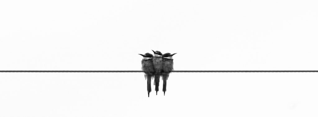
But what is minimalism in design? 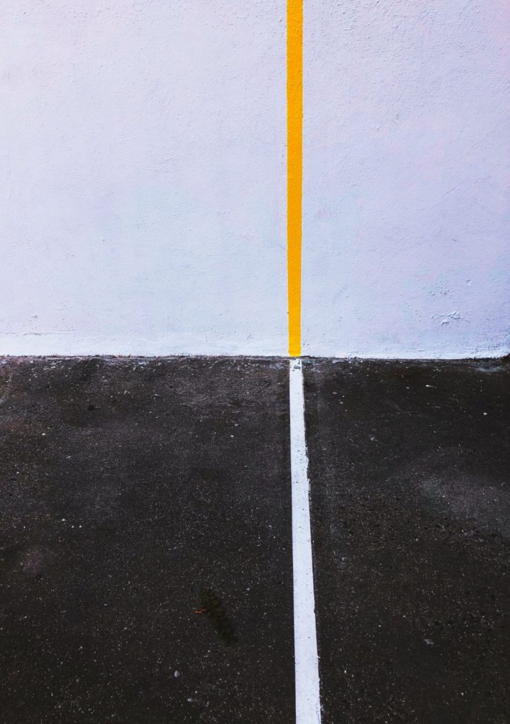 Focus on key elements in design
It was slow yet evident, designers started to steer away from heavy gradients, 3D designs, loud colors and complex typography moved to wire-thin typefaces and subtle shades. Minimalism slowly became a refreshing contrast from the dated, overly detailed design concept of skeuomorphism. It used color, geometric shapes, white or negative shape to reduce a design to simplicity. You can learn more about the typography here. According to the philosophy of minimalism, a design is minimalistic when you cannot remove anything else from the design to improve it further in any way. Simple yet impactful, that is what minimalistic designs hope to be.
Principles of Minimalist Design
The founding principles of minimalist design are heavily influenced by Zen Buddhism which values simplicity and is often emulated by the Japanese designers. These principles include sentiments of Ma, Ikebana, and Wabi-Sabi.
Ma which roughly translates to white space. Ikebana which speaks of the arrangement of flowers, or in the case of minimalism design, the way elements are arranged together. Lastly, Wabi-Sabi where Wabi translates to rustic simplicity and Sabi translates to taking pleasure in the imperfections.
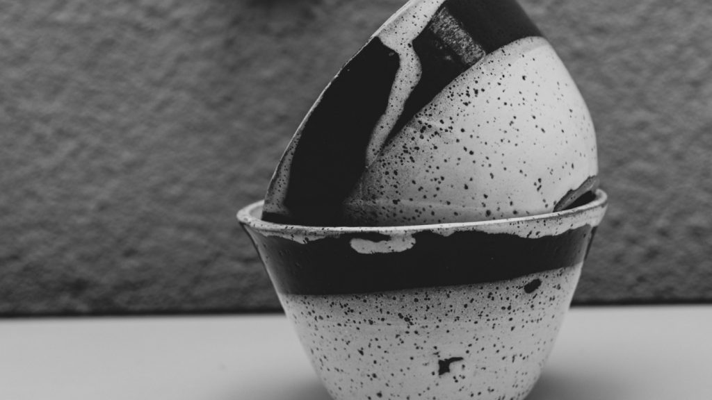
Wabi-sabi the art of appreciating imperfection
All these aspects can be widely felt in minimalist designs, the creative use of white spaces, the carefully collected arrangements that improve the intricacy of the design and the pursuit of great simplicity. Instead of maxing out on the textures, filters, and layers the effort resides on composition, arrangement, and deductive design approaches.
Apart from these foundations, additional principles of minimalist design include:
Practicing Discipline
When trying to communicate a brand essence through design it is easy to over-communicate, practicing minimalism in design limits the words, color, typefaces to convey just enough, not more not less. Restricting the color palette and elements to clear the focus. It is easy to distract the consumers with heavy content and loud design but does that communicate the intention? In minimalism, the intent or functionality is more important than a designer’s capabilities on how much they can fit in a screen.
Choose Standout Elements Well
Since minimalist designs already use limited elements it becomes imperative that the elements are chosen wisely. It should provide viewers a good point of focus, this also means using elements to convey a message. Limited elements mean the ones used need to exert enough influence and the supporting elements should not strip away from the distraction.
Why does minimalist design work?
-Generates Attention
Standing out from the noise with less. The key element of minimalism is the use of white space with focus on one or two stand out elements, this allows viewers to focus on what matters, what is important. Be it the logo name, brand colors but things that cut through the noise and increase the viewers’ attention and recall. This attribute becomes especially important when dealing with a sea of content. With so much content and design noise, what you place and where you place it matters.

-Easy Transfer To Promotional Material
When a logo or design is simple with minimum use of colors transferring it to promotional material is a lot faster and easier. As minimal design transfers well in most objects, the designer will not have to spend much time altering and adjusting the designs to different backgrounds, saves time and delivers smart looking promotional material.
-Facilitates The Minimalist Movement
The rise of basic wear, the Marie Kondo movement and the growing need to de-clutter have caused millennials to aggressively adopt the minimalist movement. The phenomenon of growing consumer content and their pull towards minimalism has been transcended to their preference for minimal content, website and brand material as well.
-Helps Alter Mood
Minimalistic designs are often misunderstood for being easy to design but the need to be selective and choose only what serves you can restrict designers. Every and any detail can be noticed, hence minimalist design puts great focus on the colors. Colors that resort to subdued tones and neutrals with similar undertones rarely go wrong. More so, these colors usually help to exude a sense of calmness which is a running theme in minimalism. However, for novice designers choosing the right color palette can be difficult, in such cases designing tools powered by AI can allow designers to have helpful suggestions and provide more freedom to choose the creative direction they want the designs to pursue.

-Consistency Achieved Easily
The limited use of elements, shapes, and colors means less things to keep track of. As a designer, that would mean generating work that transcends easily, flows better and as consumers, it means being able to draw associations between these elements and improve brand recall. This also reduces irritability among consumers as they are able to focus on important aspects of the designs faster and draw better connections.
-Create Timeless Designs
Adding in trendy new designs and elements that are of the current times can boost the relevancy of the brand. For the timeless aspect of branding like logos, the relevance needs to extend beyond the trendy months. Minimalism allows for designs to achieve a timeless feel. The restraint used designers in minimal design means it stays current even as the years pass by.
-Facilitates Easy Brand Recall
Nike’s swoosh is well known everywhere, a design that includes solid minimal design is incredibly easy to recall. The half bitten Apple, the Nike Swoosh all have one thing in common, their use of minimal design, simple colors that have created a big impact. Without excessive elements out there the recall is easier on the products as well.
![]()
The Future Of Minimalist Design
Minimalism has a strong presence in Silicon Valley, evident in the flat design and material design concepts used by Microsoft and Google. Minimalism is showing signs of evolution as well, shifting slowly into neo-minimalism, where designers are showing freedom on the types of colors, shades, and shapes they used, involving certain characteristics of skeuomorphic designs such as gradients and shading which is evident in the new Flat 2.0 design concepts. For example, tools like Graphicmaker allows users to choose from a range of flat graphics.
The minimalist design was used to escape the overbearing sense of skeuomorphic, it is also greatly influenced by the minimalist movement hence only time will tell if changes in any new lifestyle movements will be extended to the design world, chances are it most definitely it will.