RED
Red is a bold and powerful hue typically associated with the following: passion, high energy, love, warmth, sex, warfare, anger, fire, danger, and confidence.
This color is known for its striking and vivid personality. Research has shown that red enhances metabolism, increases respiration rate, and raises blood pressure, which is why it often brings out intense emotional responses from its viewers. Restaurants, for example, utilize this quality of red, as they incorporate red into their brand elements to heighten appetite. Other brands have used the color to similarly heighten feelings of excitement, anxiety, and thrill.
Red has high visibility, which is why stop signs, stop lights, and fire equipment utilize the color. In heraldry, red is used to indicate courage.
The deeper the red, the darker and more intense the associated emotions become. Bright red often represents joy, passion, sensitivity, and love, while deep red is often associated with vigor, rage, malice, and wrath.
Need complementary colors for bright intense red? Color Wheel by Color Matcher will generate complementary hues to instigate the right feel for your design.

ORANGE
Orange marries the fierceness of red and the cheerfulness of yellow, often being associated with the following: youth, vitality, friendliness, casualness, playfulness, determination, creativity, humor, stimulation, affordability.
Orange increases oxygen supply to the brain, producing an invigorating effect and stimulating mental activity. It is not as aggressive as red, but is still associated with warmth and familiarity as orange is also the color of fall and harvest. Orange evokes energy and playfulness, which is why it is often used by brands targeted towards young people.
As a citrus color, it is also associated with healthy food and has a similar effect of stimulating appetite. In heraldry, orange is symbolic of strength and endurance.
Need help deciding which text color to use for your Orange background? Try Text function on Color Matcher to find out.
YELLOW
Yellow has the advantage of being both light and bold at the same time, often being associated with: optimism, happiness, cheerfulness, hope, loyalty, youth, energy, warmth, enlightenment, brightness.
Yellow is known as the sunshine hue, evoking happiness in its purest form. Yellow is an attention-grabbing color similar to red, but without the intense associations, as it is often seen as lighthearted. However, when overused, yellow may have a disturbing effect. Studies have shown that babies cry more in yellow rooms.
Yellow is also called a ‘childish’ color, making it one of the favorite colors used by companies that create children’s products. In addition, it has a spontaneous and unstable undertone, making it a bad choice if you want to evoke stability and safety.
More dull or dingy shades of yellow tend to have more negative associations, representing decay and sickness.
GREEN
Green is a versatile hue often associated with: nature, good luck, wealth, wellness, health, balance, soothing, renewal, organic, freshness.
Green is a hue packed full of meaning. It is first and foremost the color of nature, evoking images of lush forests, fruitful harvests, and prosperity. It also instills a sense of growth, safety, and stability.
Green is said to have great healing power, as it is the most restful color for the human eye. It is a common color used in branding. Its meaning completely transforms as it harmonizes with all other elements of a design. Grocery chains and food markets typically use the color for its associations with freshness and organicness. Financial institutions, on the other hand, use it for its undertones of prosperity and wealth. Some medical and pharmaceutical companies even use this color when branding medicines to denote trust and safety.
In heraldry, green indicates hope. However, the darker the shade, the more negative the associations. Dark green typically indicates destructive ambition, greed, and jealousy.

BLUE
Blue is another versatile hue that drastically changes meaning depending on usage. It has associations with the following: calmness, tranquility, peace, stability, responsibility, refreshing, relaxation, sadness, trustworthiness, wisdom.
Blue is the color of the sky and the sea. Because of this, it has strong associations with vastness and depth. Blue is considered to be beneficial for the mind and body. It slows down human metabolism and produces a calming effect. Blue also has strong relationships with religion, as it is also the color of purity, goodness, and faith.
Blue is a common color seen across many different industries. It is used to promote products and services related to cleanliness (water purification filters, cleaning liquids), air and sky (airlines, airports), and water and sea (sea voyages, mineral water). Blue, however, is not recommended for any food or cooking products as it suppresses appetite.
Blue is also linked to consciousness and intellect, making it a good color to suggest precision and advancement for high-tech products. In addition, banks make use of this color for their ability to evoke trust.
Need complementary blue palettes to add depth to your design? Palette function delivers a range of color tones and palettes that jive together.
PURPLE
Purple combines the stability of blue and the energy of red, and is often associated with: imagination, idealism, mystery, magic, intrigue, royalty, luxury, extravagance, creativity, nostalgia.
Purple is a color of great historical significance. In ancient times, purple was a significance of wealth and luxury. Only members of the royal family and the elite class had access to purple dye. This was because it wasn’t a naturally-occuring color; thus, it was extremely expensive and difficult to come by.
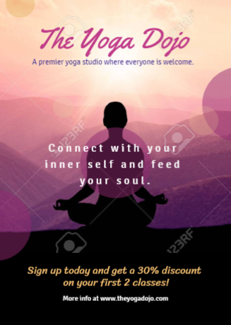
Today, purple still has strong associations with luxury, working well with brands that offer high-end products. Purple is also associated with peace and harmony, making it a good choice for products or services that wish to impart tranquility, such as yoga studios.
Given its unnatural origins, purple also has a mystical allure. This is the reason why it is often associated with spirituality. It evokes images of sacredness, fulfillment, and a higher self. Purple also represents familiarity and nostalgia. Check out more inspirational templates here.
Read More: