
“Color is my daylong obsession, joy, and torment.” – Claude Monet.
Once ridiculed and mocked for his “unusual” approach to painting, Claude Monet had now successfully carved his name in the hall of art geniuses. He and his fellow impressionists were the first to break away from the meticulous realism practiced by their predecessors. Rather than trying to depict the subjects as accurately as possible (ie. realism), Monet was determined to capture the overall impression of them, much like how the subjects would be seen from afar.
Monet was relentless in his pursuit of outdoor paintings, adopting a technique of short and quick brushstrokes to capture the effects of natural light on sceneries. This was considered uncommon back in the early 19th century, as artists are usually commissioned for portraits and tend to paint indoors. However, by breaking these boundaries Monet had created an art movement that would be known for centuries to come. His style of painting is what we call today as Impressionism. Want to know more? Browse through this series of stunning color palettes we have curated just for you – All from the works of this legendary maestro!
Not only this article would get you started right away with color inspirations, but you can also use our AI-generated tool to help identify the perfect color palette for your design. Now, let us guide you through brief art analyses on what makes each of Monet’s works so memorable.
10 Famous Monet Paintings to Get Your Color Inspiration
1. Lush Summer Vibes
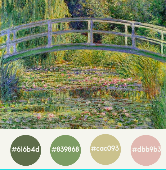
Monet’s ‘Bridge over a Pond of Water Lilies’ is without a doubt one of his most iconic pieces. The painting was based on a garden he personally owned and planted on; being a dedicated horticulturist himself. Having over 18 renditions of this exact Japanese bridge and water lily pond, it is safe to say that this view had become Monet’s beloved muse. This well-known masterpiece specifically depicts the warmth of summer, with reflections of the water lilies being emphasized on the water surface. Such a palette is perfect for your nature-inspired designs! To find similar palettes, click here.
2. Monochromatic View
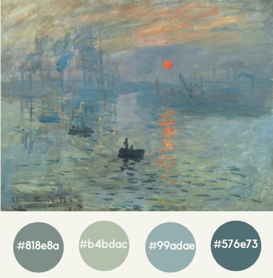
The painting above is considered to be his early work in Impressionism; in which Monet illustrates a hazy view of a French harbor. The term ‘Impressionism’ itself is actually derived from the painting’s title, though it was first used as a taunt by an art critic. However, many viewers had agreed that this magnificent piece conveys serenity due to its monotone colors (despite the slight orange and yellow shades used for the sun). Needless to say, monochromatic color palettes would never go wrong – it is guaranteed to give your designs a calm and pleasant mood.
3. Elegant Earth Tones
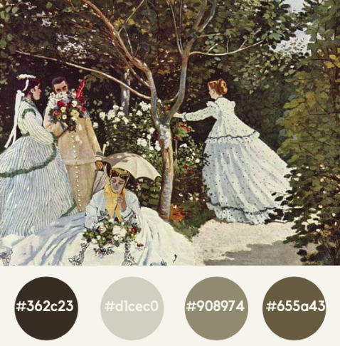
In this particular work, Monet was determined to elude the impression of light dancing around figures in a landscape. Even the sunlight flowing through the leaves can be seen when looking closely. Monet skillfully emphasized the white of the women’s attire, making it the central focus among the harmonious brown and greens surrounding them. You too can try experimenting with earth colors mixed with white to create breath-taking designs.
4. Pastel in Nature
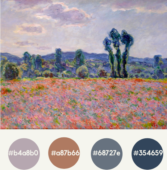
In Monet’s ‘Poppy Field’, he successfully captured the fluttering colors of the flower field swept by the wind. In this approach, he foregone attempts in detailing to ensure he would depict a “massy surface” that is blown sideways. Observe how he is unafraid in mixing pastel tones with dark shades (for the trees and greeneries). Much like Monet, don’t be afraid to mix and match colors to create a unique composition in your artwork.
5. Myriad of Colors
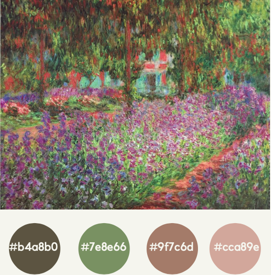
‘Artist’s Garden’ is the prime example of how revolutionary Monet was in his usage of colors. Though the overall impression we have is of the purple flowers, when one looks closely, a myriad of colors can be found interwoven beautifully across the canvas. Shades of browns, golds, and blues can also be observed, though their presence is not noticeable at first glance.
6. Vibrant Sunsets, Bold Twilights
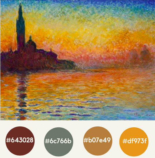
Also known as the ‘Sunset in Venice’, the artwork pictured above depicts the ever-changing aspect of light. The intensity of the sunset is reflected greatly in the water’s movement, while a mixture of orange, purple and yellow was utilized to capture the vibrancy of the scenery. As for the shadows and silhouettes, Monet was careful not to use black but adapting dark blues and violet instead. Interested in color schemes such as this? Discover some more here.
7. Expressive Autumn Colors
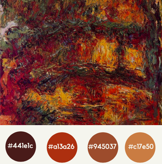
In his early 80’s, Monet’s eyesight had deteriorated due to a cataract in his right eye. The artist was visibly distressed with this condition and underwent three surgeries in an attempt of restoration. Interestingly, ‘Water Lilies – Japanese Bridge’ was produced during this trying period of his life; a clear indication of this would be the vibrant shades of reds and yellows as a result of his impaired vision. However, this specific color combination had produced an emotive and overall striking impression; suitable for attention-grabbing (or perhaps autumn-themed) designs.
8. Shades of Blue
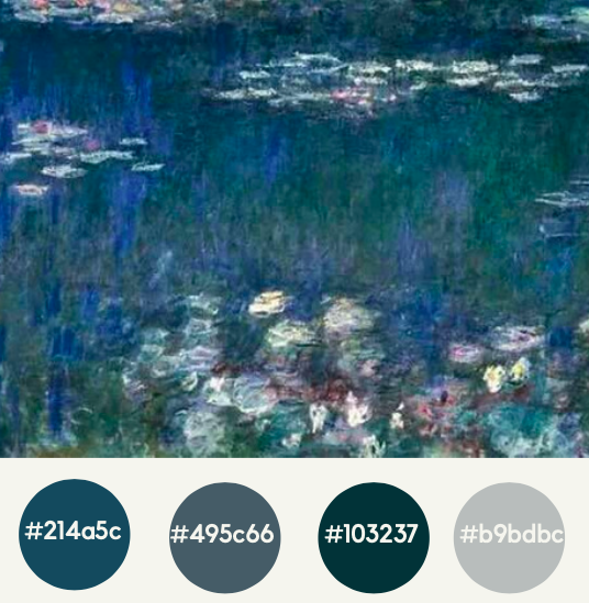
In this last piece of his water lily paintings, Monet had achieved incredible recognition; allowing him some room to experiment and explore with motifs. This piece is known for the artist’s focus on color, which can be reflected in the greeneries of trees seeping into the violet-blue depths of the pond. When observed closely, minuscule accents of yellow, pink, and red can be found in the center of each lily, a true testament to his smooth brushwork. Cool tones found in this palette are perfect to depict tranquility in your design works.
9. Warmth in Wintertime
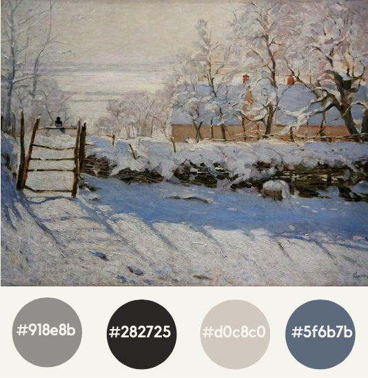
The stunning contrast between the shadows and the light against the snow-covered landscape in this artwork depicts total tranquility for its viewers. Many art critics are in consensus that this piece was the first Impressionist painting ever made, though it was created five years prior to the art movement was officially known to the public. Notice the warmth that this painting exudes even with winter as its main theme; this is an example of good juxtaposition that can be used in your designs too.
10. Landscapes galore
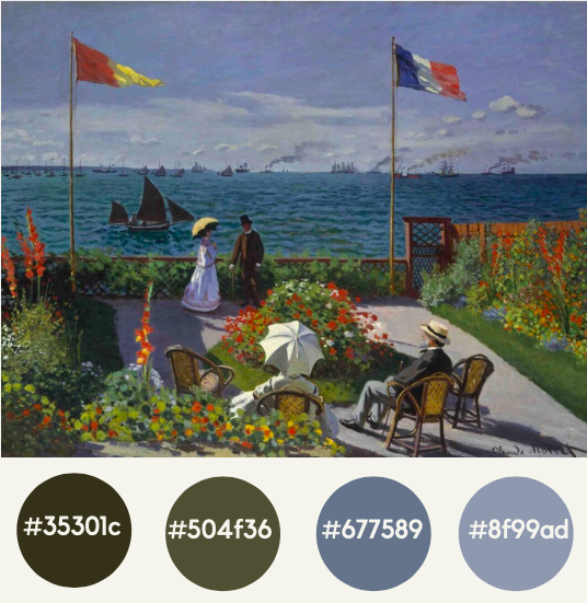
As you may have noticed, Monet had a strong affinity for landscapes with flowers or water. This scene pictured above was painted with much enthusiasm, with his future artistic development being displayed prominently. The composition is a mixture of both traditional and contemporary approaches, with separate brushwork and blotches of bright colors. In this illustration the sunlight’s reflection bouncing off the white surfaces was accentuated intensely, depicting a warm sunny afternoon with brilliant skies.
Ready to embark on your journey of color-exploring?
Now that we have shown you some of the best examples of Monet’s color schemes, no one is better prepared to design than you are! Take examples from this renowned painting master and be bold in forming your own color palettes. Swipe all doubts and fears aside and find which color schemes speak into your soul.

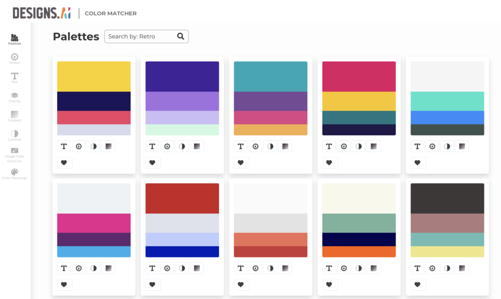
Or, if you are still unsure, you can simply extract color palettes from an image you love using our assistive AI-powered tool, Color Matcher.

Once you have gained enough confidence in your color matching abilities, feel free to use another feature; Color Wheel, in which you can personalize your own color combinations or learn about the many formats of color harmony rules (such as triad, tetradic, compound, analogous and etc).
Here are a few tips to get you started;
- Monochromatic
A palette consisting of a single hue that is expanded to three or more shades of that same color.
- Analogous
The color scheme contains several colors that are positioned next to each other in the color wheel, creating a rich monochromatic look.
- Complementary
Complementary colors are color pairings that create the most contrast; meaning when combined, they cancel each other out and produce a grayscale (such as grey or black) instead.
- Compound
This color scheme includes choosing a color and two others that are next to its complementary colors, which makes it somewhat similar to complementary color schemes. The special addition would be the adjacent colors would create a more appealing and harmonious palette.
- Triad
Triad color scheme, living up to its name, is composed of three colors evenly spaced on the color wheel. The most basic triad combinations would be of the primary colors; red, yellow, and blue.
- Tetradic
Tetradic color schemes mainly consist of two sets of complementary colors, which made up to a total of four. Together, they form a rectangle on the color wheel, with only one color apart for the short sides of the rectangle.
Still can’t find the perfect palette for your design? We have you covered! Just browse through our collections of premade palettes, all FREE for you to use. Other features available under Color Matcher also include; color meanings, contrast setting, text and color editing, and many more.
What are you waiting for? Get Started Now!
Read More: