
The use of images in an e-book makes a huge impact on its marketability and readers’ reception. Images have to be formatted with an effective layout regardless if it is on a book cover or on the inside pages of a book. This ensures better marketing for the e-book as well as increases readability. Here are 30 tips on how to use images effectively when creating an e-book.
1. The correct use of landscape and portrait photos
The use of landscape or portrait photos affects how readers accustom to the text of the e-book. Landscape photos give a wider view of the platform, keeping the readers’ eyes in line with the text they are reading while portrait photos are more suited for text-heavy books as it is easier to read a large number of texts. You just have to choose the image layout that is best suited for your kind of e-book.
2. Use themes
The use of themes for images in an e-book allows you to set the look and feel of the book you are presenting. It gives a unified overall visual for the book. The arrangement of themes include the following:
- Fonts
- Color scheme
- Templates
- Feel of images
- Ideas being depicted in the images
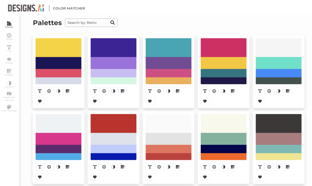
3. The use of best color combinations
Based on color combinations, an image’s idea could vary. When using images in your e-book, ensure that you are using the right color combinations that relate to the contents of your book.
4. The background
The existence of backgrounds in an image affects how pictures are laid out in an e-book. The background should always be lighter than the image. The safest and most common color used for an image in an e-book is a white background.
5. Four colors are enough
When using colored images, do not use more than five colors. Four is enough. This signifies neat lay-out and clear ideas in an e-book. However, this may vary according to circumstances.
6. Scaling is important
When you use an image in an e-book, do not underestimate the size of the file or image to be inserted. More often than not, huge file sizes take a little bit longer to load. Do not use lesser quality materials to achieve a better result. Invest in high-quality images if you want vivid photos for your e-book content.
7. The right file type
Some designers forget the proper file type of pictures that can be used in an e-book. The best image formats to use in an e-book layout are .jpeg and .png. Never use a vector, a bitmap, or an ai. Also, refrain from using raw camera files and Photoshop or .psd files.
8. Proper sizing
Proper sizing is also important in the images that you put on your e-book. To decrease the file size of the photo means also lessening the number of pixels of the image.

9. Proper compression
Raw image materials are usually larger in file size than JPEG format. This is why it is very important to save your document photo in Jpeg format. Proper compression is also needed to eliminate unnecessary elements in an image.
10. Don’t wrap text around the image
Keep everything in line (above or below) the image. Do not try to wrap the text (in any form) around the image in your e-book.
11. Don’t use enormous size images
Although images are important, it is also advised to consider the size of the photo you are using. Remember, e-book readers such as Kindle can have big screens but loading huge file size can take a little bit longer, which can make readers crazy.
12. Software that you might use
When using images for your e-book, there is a huge possibility that you might use programs or software to alter, change, or improve pictures. This is why it is very important to at least understand and familiarize yourself with the basic programs. Among the widely used software in photo editing are Adobe Photoshop, Corel Paint, and SnagIt.
13. Using Screenshot
Aside from photos, you can also use screenshots in your e-book design. Screenshots are the actual appearance of the screen captured. This is usually used when you are designing a tutorial e-book where you need to show the readers what the screen would look like when they perform a certain command or process. Both PC and Mac platforms have screenshot default software that you can use.
14. Preparation of images
Before preparing the images for your e-book design, you must not forget the following preparatory works:
- Limit the file size
The most ideal size of an image in e-books is 50MB. If your file size exceeds that number, you can decrease the pixel property of the image before publishing the e-book.
- Image format
Another factor to consider is the format of the image you are about to use. The best and most ideal format of an image is JPEG and PNG.
15. Put the image at the center
The most ideal place to put your image in an e-book is at the center of the page. When formatting the image inside the text, make sure that the first line of the paragraph is indented. Then insert the image within the text (without wrapping the text around it.) This also ensures that you will not accidentally delete the photo when you backspace any part of the preceding text.
16. The size of your cover image
Whether portrait or landscape, the size of the image used in a cover of an e-book should be at least 1400 px in length and 2100px in height. It should be in JPEG format and should be at least 300 dpi.

17. The exact size of the images
Do not worry too much if you are not able to achieve the exact size of the image in your layout. What’s important is your image falls within the range of the required size of the picture needed.
18. Diagrams, images, tables, and other objects
If the e-book needs to include special objects such as diagrams and tables, the same tip for images apply. It is recommended to put the object at the center of the page and avoid wrapping text around it.
19. Pictures from digital cameras
If pictures are taken directly from digital cameras, it is recommended to convert the file first on RGB and JPEG or PNG file. You can also use a scanner if images come from other sources such as printed references.
20. The use of Photoshop for coloring
It is suggested to use Photoshop when enhancing images in an e-book. For image coloring, it is recommended to use RGB color. If the image is in CMYK color palette, convert it into RGB to enhance the color properties.
21. Have an image template
Have a specific template on where to put the image on a page. However, placing images is usually customized, depending on the content. Among the most common places to put an image include:
- The top of the page
- Top of the text
- At the middle of the page
- At the bottom of the page
22. Utilize high-resolution photos
Use high quality or high-resolution photos as much as possible. For amateur photographers who take their own pictures and lay them out on a page, it is recommended to follow the aforementioned tips about the size and color type of the image.
23. Image sizes based on publisher
It is very important to note where you plan to publish you e-book in the first place. There is Amazon, Kindle, Kobo, as well as Barnes and Noble. There are also Apple Books, Lulu and Smashwords. All these e-book readers have different requirements that you need to follow.

24. Clear images for clearer details
It is very important to use clear images to deliver clear details on the e-book you are working on. Another major tip you need to consider is the content of the e-book and how to incorporate the most suitable image with it.
25. The use of colored backgrounds
Colored backgrounds are helpful to create contrast in the image. This allows your image to stand out from the rest of the page, which is usually filled with texts.
26. Tips in using background
If you decided to use a background on your photos, consider the following tips:
- Use lighter colored background for strong colored images
- Use strong colored background for light colored images
- Use border lines
- Center your image on the page
27. Simplify the elements of the image
Keep your image simple as much as possible by eliminating unnecessary elements.
28. Use exaggerate texts
Contrary to the previous tip, there are designers who prefer the use of bolder and exaggerated texts. This includes large sizes of texts, fonts and contrasting colors. When using exaggerated texts, make sure that they are still legible inside or beside the images. You can try a free tool like Font Pairer to choose what fonts work the best for you.

29. Tell a story
The image itself should be able to tell a story and deliver the thought of the e-book.
30. Determine the focal point
When putting an image on the page, it is advised to look for the focal point or center of the image and have it placed on the best location on the page.
BONUS!
Before e-books came along, we could all appreciate a nicely designed book cover. Designmaker has some amazing book cover designs for you to choose from. Imagine flipping open a new book with a very eye-catching cover design. Doesn’t that make the book feel that more worth it? Check out some of our book cover designs now!
Read More: